Something I've done in the past, and should probably do more often, is just to prepare a huge sweep of charts and let the numbers do (most of) the talking. So in that spirit, here are my 17 for '17, looking at where we are, how we got here and what we might expect in 2017.
The defining event in the UK in 2016 was of course the vote to leave the EU, and this chart storm includes some of the latest data. But the broader theme – both in Britain and across the West – was the struggles of liberalism and the centre-left, as several of the charts will show. The Conservatives are in a remarkably strong position for this point in the electoral cycle, Labour some way behind, and an interesting battle developing among the other parties.
Also included are a look at the impact of the proposed boundary changes and some of the unlikelier things that punters are betting on for 2017.
So let’s get started:

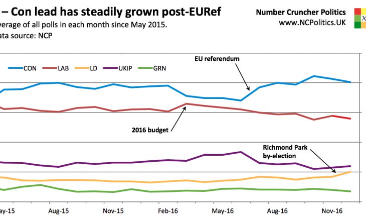
First, a recap of the last 19 months. There will be a proper NCP polling average in the new year, but the basic trends are reasonably clear from a simple average of all polls fielded in each month. From May 2015 until the 2016 budget, support for all parties was stable and close to the levels they polled at the last general election.
Following the budget, the gap between the Conservatives and Labour narrowed considerably, with three polls putting Labour ahead (and two more showing a dead heat). UKIP also made progress in this period, which also marked the run up to the EU referendum. But following Theresa May’s appointment in July, the Tories made further gains, returning to the sort of leads they had earlier in the parliament, and gradually increasing them further, particularly after the party conferences in September and October.
I’ll return to the smaller parties in a later chart.

One thing the first chart doesn’t really show is how strongly the Conservatives are polling compared with how the governing party normally post at this point. This chart shows the lead that the government of the day has over the opposition, specifically how it’s changed from the election result. The historical polling data here, as usual, comes from Mark Pack’s database.
While historical comparisons are always a bit tricky due to changes in polling methodology, the general picture is clear – by this point there is usually a swing towards the opposition compared with the prior election. But in fact, there has between about a 3 per cent swing towards the government. The only other example of a governing party still running ahead of its popular vote lead from polling day at this point was New Labour in 1998.
Therefore in terms of swing from the prior election, this is the strongest Tory performance at this point in a parliament since polling records began in 1943.
17 for '17 – a collection of charts for the new year
|
31st December 2016 |


