Earlier I posted some initial thoughts on the geography of signatures for the petition against the Trump state visit to the UK. The reaction on social media was that it had to be correlated with “X”, where “X” was quite a few things.
Here’s some analysis of the correlation coefficients for different “Xs”. For those of you that don’t play with numbers all day, that’s basically a measure how much, on a scale of 0 to 1, of the geographic variation is explained by a particular characteristic – negative means when one is high, the other tends to be low.
Also, as I noted earlier, the signature rates are particularly low in Northern Ireland, so the following analysis is for Great Britain only.
Firstly let’s look at the correlation by party support. Among the “traditional” three main parties, the relationship between 2015 vote share and signatures as a percentage of each constituency’s electorate is weak, with r=-0.14 for the Conservatives, +0.16 for Labour and +0.21 for the Lib Dems.
But there’s a much stronger correlation with support for the anti-establishment parties, of +0.63 for the Greens (recall that Brighton Pavilion topped the table of first million signatures) and -0.61 for UKIP.
Next, demographics. A lot of people asked about areas with large muslim populations. The correlation isn’t that high, at +0.34 (based on the 2011 census), but that doesn’t mean that few British Muslims aren signing the petition. There is a lot of variation between areas with very small Muslim populations, so the latter on its own has a low correlation nationally. If we look instead at ethnicity and country of birth, the correlations are stronger (-0.47 for the percentage describing their ethnicity as white and -0.64 for the percentage born in the UK).
| Con15 | -0.14 | c11EthnicityWhite | -0.47 | |
| Lab15 | 0.16 | c11BornUK | -0.64 | |
| LD15 | 0.21 | c11Muslim | 0.34 | |
| UKIP15 | -0.61 | c11FulltimeStudent | 0.55 | |
| Green15 | 0.63 | c11QualLevel4 | 0.77 | |
| SNP15 | -0.37 | |||
| PC15 | -0.02 | AB | 0.11 | |
| C1 | 0.15 | |||
| CH_Remain | 0.82 | C2 | -0.10 | |
| EU_petition | 0.91 | DE | -0.12 |
What about socioeconomics? The correlations with NRS social grades are all low, ranging from +0.15 for the incidence of C1s down to -0.12 for DEs. The high levels of support in university towns prompted a lot of speculation about student-heavy areas, but the correlation there is modest at +0.55. What is a much better predictor is eduction levels among the population as a whole – it’s +0.77 with the share of the population that have “level 4” (degree or equivalent) qualifications.
If this all sounds a bit familiar, it’s because it is. Support for Trump in the US and support for Brexit had strong correlations with education. Because the EU referendum results were declared by council area, we don’t know for certain what they were by constituency. I’m working on NCP estimates of these, but in the meantime we can use the well known estimates from Chris Hanretty at UEA. The correlation of the Remain vote share with the Trump petition is +0.82.
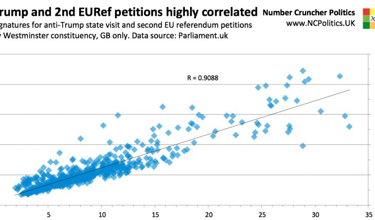
But, as Chris pointed out in his paper, some constituencies simply like signing petitions more than others, even after controlling for the subject. So if, instead of looking at the estimated Remain vote, we look at the correlation between signatures in support of the Trump petition and in support of second referendum on EU membership, the correlation goes even higher – to +0.91.
So the bottom line is that support for this petition appears to be coming both from the sorts of areas where Brexit is strongly opposed and those that like signing petitions.


