Other warning signs
Cognitive dissonance can sometimes betray itself in conflicting answers. In particular, many have noted that for almost all of this parliament, the electorate’s voting intention has been at odds with its views of party leaders and economic competence. These two measures are usually strong predictors of how the country votes.
There have been examples of parties losing when polling ahead on the economy (Conservatives in 1964) or on leadership (Labour in 1979). But to quote YouGov President Peter Kellner:
“I can find no example of a party losing an election when it is ahead on both leadership and economic competence.”
Nor could I, but I can find an example of a party being ahead on the economy and ahead on leadership, but unable to pull meaningfully ahead in opinion polls. That was the Tories in – you guessed it – 1992.
Some of the field intelligence fits the picture too. My instinct is to be sceptical about this kind of information, but when well-placed sources sympathetic to the party that appears to be underperforming their polling write things like this and this, the fact that it is so consistent with the data seems telling. For the record, the Russell Brand story was described as “nonsense” by one Labour figure, though others haven’t commented. The key point is that the some of the seats mentioned in those pieces shouldn’t be anywhere near in play if the polls are right.
So there are plenty of reasons to expect that there are greater-than-normal risks of getting it wrong. But can polling failure be modelled? Well, I’m going to try…
Constructing popular vote models that outperform opinion polls (in theory)
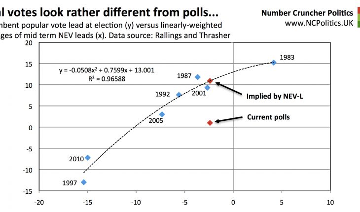
In order to model the relationship between opinion polls and the actual popular vote, I’ve taken all of the polls for which the fieldwork ended in the final 48 hours before each election, or the final five if fewer, and taken a straight average. The most important number in any general election is the spread between the two largest parties (often expressed as half its net change since the previous election – the swing). I’m using the elections for which all models have data available, which means 1983 to 2010.
The following chart shows how the relationship has played out in practice – the fit is not linear, but concave with respect to the origin. This may appear to be due to 1992 and 1987 pulling up the middle of the chart, but as subsequent charts will show, that is not the cause – whatever you use to predict popular vote share, it seems a linear fit would underestimate the incumbent more when the election is close. I can only think that this is related to turnout – when elections are (expected to be) close turnout tends to be higher, which seems to help the incumbent outperform.

But this model, like pretty much every forecast model with the sole (I believe) exception of Steve Fisher’s Elections Etc, treats bias symmetrically, irrespective of whether it’s a Labour- or Conservative led government. Whether this has become common practice because of the 2010 result, or because of political correctness (so to speak), it doesn’t fit the historical pattern well. So my first stab at an estimate is an “adjusted polls” model, which is based on a constant three-point party-specific adjustment in favour for the Conservatives. This is based on historical patterns – I’ve avoided trying to optimise it for fear of overfitting given the limited number of data points.

This is clearly a much closer fit. In fact if we allow for some of the specific technical issues in 1992, and the fact that 2005 was the second-lowest turnout election in the history of the universal franchise, (possibly because its outcome was far closer in terms of seats that had been expected), the fit is closer still. Or if you exclude 1992 altogether, the fitted curve is about a point lower in that area, giving a current estimate of polling error of about 5 points net, remarkably similar to the to the average of the errors in polls in the last two years.
Also derived from polling data is the second model, based on the spread between the MORI gross satisfaction ratings of the Prime Minister and opposition leader (the GSS model). If this historical pattern holds, Dan Hodges is about to be proven right:

The 2015 datapoint is from the most recent MORI poll, which did show a sharp move in the toplines – but leader ratings tend to be more stable over time. An 11-point spread is also exactly equal to the average of all MORI polls in 2015. Note also that the non-linear relationship described above still holds.
(Continued, please navigate using numbered tabs…)
