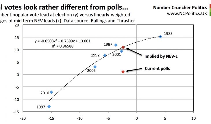
But what if we had no opinion polls and had to rely purely on real votes? Fortunately, there is a fairly reliable way that we can forecast the spread without using polls at all. After each year’s local elections, Professors Colin Rallings and Michael Thrasher at the University of Plymouth produce estimates of a National Equivalent Vote (NEV). The method of calculation of this is extremely sophisticated, but essentially it can be interpreted as the vote share if every council ward in Great Britain had been contested, with every party fielding a full slate.
Work in this area has already been done by Rallings and Thrasher themselves and by Chris Prosser at Manchester. What I’m doing here is more specific – taking the spreads between governing and opposition parties at local elections in non-general election years, and averaging them using linear weights. To avoid overfiting, I’ve again kept it simple with the weighting – the linear average puts the most weight on the penultimate year elections.
Some will be concerned about using local election data on the ground that their turnout has been low recently. In fact, it always has been:

So the local elections in this parliament should be no less informative than those in the past. This model has the biggest discrepancy with current polling of them all – 10 points, one point more than in 1992.

What the model highlights is that relative to the Conservatives, Labour’s performance in local elections is the second worst by any opposition in the 35 years for which the data exists. They won last year’s local elections by just one point (or two points on the similar John Curtice/BBC PNS measure). In 1996 they won by 14 points, and in 2009 the (opposition) Tories won by 13 points.
The only time a governing party has done better relative to the opposition in pre-election year locals than David Cameron’s did in 2014 was the Conservatives under Margaret Thatcher in 1982. This was not only peak Thatcher (in terms of her own and her party’s ratings) but the local elections that year were right in the middle of the Falklands War itself. In 1986 and 1991 the Tories lost by 2 points more than they did in 2014. Therefore the picture from actual elections doesn’t remotely fit with that of the opinion polls – taking the model purely at face value gives a popular vote lead of about 11 points.
Let me be absolutely clear about the significance of this. As discussed already, there have been some significant shifts in the political landscape over the last five years, not least coalition government. It’s perfectly plausible that the changes have broken these models, in which case we can expect the sort of inconclusive outcome that polls are indicating. But it is also quite possible that it’s the opinion polls (themselves models of public opinion) that they’ve broken. If the pattern in this particular model does hold, then the most likely outcome would be a Conservative victory with an overall majority.
Given the apparent predictive power of events no less than a year before a general election, it is reasonable to wonder just how much impact campaigns actually have, given that parties’ fortunes appear to be determined so far in advance. The answer is likely to be that campaigns are akin to a tug-of-war – if only one side put the effort in, they would win, but if both do so, they largely cancel one another out.
That three fundamentally different methods of prediction are giving pretty similar results – far removed from what the polls are saying – gives confidence that they provide strong clues as to direction of risks to polling accuracy. I’m going to go a step further by combining the three individual models. Again I’m concerned about overfitting, so I’m just going to take a simple, equally weighted average of the three. The combined results are as follows:
| Actual | NEVL | GSS | PSA | Combined | Error | |
| 1983 | 15.2 | 15.3 | 14.6 | 15.0 | 14.9 | -0.3 |
| 1987 | 11.8 | 9.5 | 11.6 | 11.4 | 10.8 | -1.0 |
| 1992 | 7.6 | 7.2 | 5.5 | 4.9 | 5.8 | -1.8 |
| 1997 | -13.0 | -10.7 | -13.5 | -12.2 | -12.1 | 0.9 |
| 2001 | 9.3 | 10.6 | 11.2 | 10.6 | 10.8 | 1.5 |
| 2005 | 3.0 | 4.7 | 3.1 | 5.2 | 4.3 | 1.3 |
| 2010 | -7.2 | -9.8 | -5.9 | -8.1 | -8.0 | -0.8 |
| 2015 | 10.9 | 7.6 | 6.8 | 8.4 |
The combined model outperforms the polls in every election except 2010, where it missed by 0.8 points rather than 0.6 points in the polls. The worst absolute error was 1.8 points in 1992 (one fifth of the error in the polls) while the average absolute error has been 1.1 points.
But, crucially, what does it say about Tomorrow’s outcome? At present it implies a Conservative lead of just over 8 points. That would suggest either a very late swing or a large polling error (and probably both). But unless these relationships have completely fallen to pieces, David Cameron will be back as Prime Minister.
(Continued, please navigate using numbered tabs…)


