Answering the exam question isn’t straightforward, because the latest electorate figures – and thus the comparison with the December 2015 ones on which the boundary review was based – were broken down by council areas (as they were the counting districts used for the referendum), whose geography is very different from Westminster constituencies.
Some have pointed out that many of the biggest registration increases of all were in London boroughs that are obviously Labour, but I’m going to examine all local authorities in England and Wales, in case the extremes of the scale are misleading.
Properly reconciling the counting areas and constituencies, in order to work out which counting areas voted which way in the general election, can be done (on 2015 boundaries) by simple addition in about two-thirds of English and Welsh seats. The rest require the same sort of modelling process that’s used for estimating the impact of boundary changes.
On this basis, we can say objectively and with confidence which counting areas in England and Wales voted which way last year, allowing us to say whether the register increased more in Labour or Tory areas. The answer might surprise you.
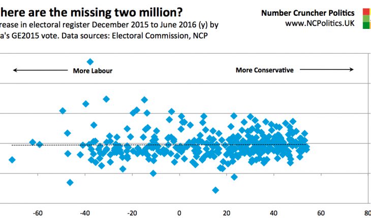
Across all Labour-voting counting areas, the register increased in total by 764,000. But across the Conservative areas, the total electorate size increased by 1.12 million. You read that right – registration increased substantially more in places that voted Tory in 2015 than those that voted Labour, precisely the opposite of what everyone assumed.
In terms of its applicability to boundaries, it makes more sense to look at the changes in relative terms, because Tory-voting areas collectively contain a lot more electors (since the Conservatives won 99 more seats than Labour). But even in percentage terms, the increases aren’t any higher in Labour areas: 4.83% in Conservative districts and 4.79% in Labour ones.
As a cross-check, I tried models based on both local election results and demographics – the results are identical.
This is reflected in the new average seat sizes, which is 74,900 for notionally Labour seats and 74,600 for Conservative seats. So blue constituencies are only about 300 electors smaller than red ones, with four years of population shifts to come before the boundaries are actually used. By contrast, Tory seats on the current boundaries are 3,600 bigger.
Another way to visualise the data is to look at the changes provided by the Electoral Comission and compare them with how Labour or Tory each area is. As the following chart shows, there really is very little correlation between registration increases and 2015 voting patterns.

The changes also fall within a remarkably right range – in 89% of local authorities, the increase in registration is within ±3 percentage points of the England and Wales average. This is important because it means that the growth in registration isn’t just very similar between Labour and Tory territory, but also relatively constant within them. In other words, this analysis not only suggests that the overall effect of using the more extensive register would be neutral nationally – it might also have limited effects even locally.
But what if we account for the fact that local authorities vary in size? The final chart shows them ordered from the most Labour to the most Conservative and sliced into 5% electorate-weighted quantiles. This illustrates my earlier point that simply looking at the areas with the biggest increases is potentially (and, it turns out, actually) misleading.

The most Labour 5% of the areas do show a substantially above average (5.8%) increase in registrations, but the next four slices (and the most Labour 25% as a whole) all show below average increases (4.6% for the reddest quartile). The chart is essentially flat – those joining the register in the first half of 2016 are not disproportionately in Labour-voting areas.
So to sum up, amid lots of misleading claims and counterclaims, there is a legitimate question about the effect of the date at which registration figures were taken. But a detailed analysis of these figures and the subsequent 2 million increase in registration in the run up to the EU referendum provides the answer. The data does not support the suggestion that using the later version of the register would materially alter the distribution of seats. Instead it points to a very even distribution of the 2 million newly-registered voters between Conservative and Labour areas.
Analysis: Do objections to the boundary review stack up?
|
16th September 2016 |
About The Author
Related Posts
Analysis
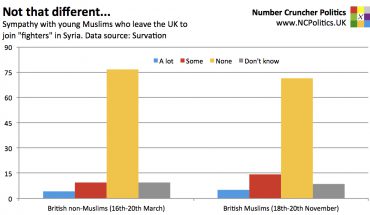
On British Muslims and Syria
23rd November 2015 |
|
Analysis
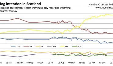
Scotland: Is the SNP lead 10 points or 28 points?
21st January 2015 |
|
Analysis
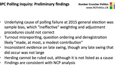
BPC Polling Inquiry: Preliminary findings
19th January 2016 |
|

Analysis
Measuring a party's 'surge' using social media
22nd October 2014 |
|