Polling for the Labour leadership election has shown a huge lead for Jeremy Corbyn. In order for him to lose, either something would have to have changed very substantially since the polls were done, or there would need to be a failure to dwarf the general election miss (or a combination of the two).
I’ll return to polling accuracy later. But the second of the YouGov polls was conducted four weeks ago. Is there any evidence that people have changed their minds? Some have suggested it’s been a “vent before the vote”, maybe people have swung back towards less radical options or perhaps the relentless warnings from grandees and the media have, at the margin, taken their toll.
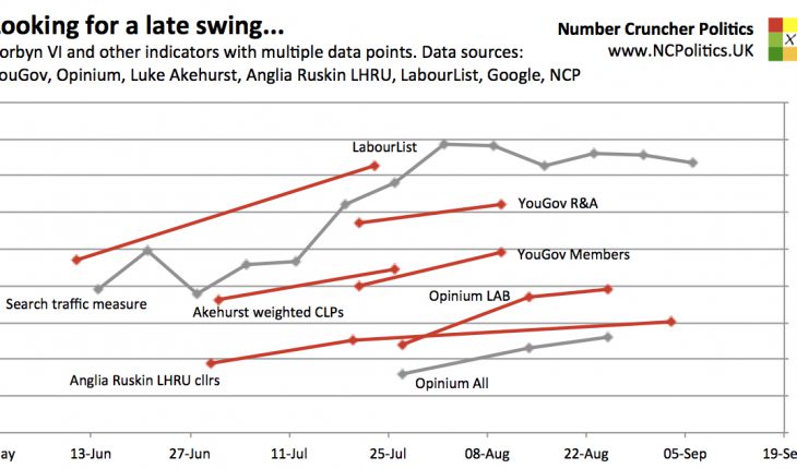
I’ve spent a lot of time looking through various bits of data for any sign of swing. The first pattern I’ve spotted is that the rise in support for Corbyn between the two YouGov polls is corroborated by literally all of the other data. This is important, because it means the swing towards Corbyn in the first place is highly unlikely to have been due to rogue results.
In addition to YouGov’s selectorate polls, we also have Constituency Labour Party (CLP) nominations. Luke Akehurst compiled data on these for Labourlist, summing the CLP members, firstly on 21st July followed by a final update on 1st August. If we take the difference in members between the two posts, we can calculate two separate batches of membership-weighted CLP nomination shares. Corbyn’s support increases sharply over the intervening period, mostly at the expense of Andy Burnham.
The thing that matters here is the change in support, not the level. There have been other scientific surveys of groups besides the Labour selectorate, but only two (that I’m aware of) have multiple comparable data points. Opinium asked their panel who they would vote for as Labour leader. Both Labour voters and voters generally have shown increasing support for Corbyn. Meanwhile, the Labour History Research Unit at Anglia Ruskin University has been polling Labour councillors in marginal seats. The sample sizes are small (about 250), however they tell me there is a huge overlap between them, with around 85% of people from each poll responding to the next. That means that movement is almost entirely due to people changing their minds, rather than possible sampling error. Again, the same pattern is found.
So the representative polls of groups both narrower and wider than the selectorate all show the same trend. This is what you might expect, in a “uniform swing” sense – different groups may have very different levels of support for a party or candidate, but similar (or at least correlated) changes.
We also have the self-selecting survey of Labour activists by Labourlist. Clearly, self-selecting survey data needs to be treated with caution, but because we are looking at changes rather than levels, response bias isn’t a problem in itself – the problem would be any change in the bias, which will very likely be a lot smaller. It, too shows a Corbyn uptrend over the period in question.
And for good measure, a (highly experimental) measure for which I need to hat tip Stephen Bush – using search traffic as an indicator. I’ve made a couple of modifications to his method, primarily to adjust for the fact that interest in the contest generally (as opposed to individual candidates) fluctuates, sometimes significantly. This yields plenty of data points, and almost exactly the same picture as everything else I’ve looked at.
I’ve also split the YouGov polls into “members” and “registered supporters and affiliates”, to avoid the picture being clouded by changes in the selectorate’s composition.

And the second pattern I’ve spotted in the data: not only does every indicator suggest that Corbyn’s support rose when the polls showed it did, but all the signs are that it has been roughly maintained over the last month or so. This suggests that Corbynmania isn’t the bubble that some have been trying to paint it as.
What do bubbles look like? Using the Google exercise above, I’ve compared Corbynmainia to three previous surges – Cleggmania in 2010 (which ended in disappointment for the Lib Dems), UKIP ahead of the 2014 European elections (which they won) and the peak of the Green surge in early 2015, which soon petered out. I’ve added Corbynmania alongside, and lined up the series so that that first major leg of the surge is in roughly the same place.

If this is in any way representative, it shows a clear distinction between a passing craze and an enduring increase in support – Corbyn’s rise looks more like UKIP’s rise in 2014 than a bubble. UKIP’s traffic started considerably higher after its success in local elections and national polling over the preceding couple of years, but the shapes are otherwise similar – there is no peak and drop as there was with Clegg in 2010 or the Greens early this year.
(Continued…)
