
(13) No-one is quite sure what will happen in May. Among all the options above, a Conservative majority trades (by an absolute whisker) as the most likely outcome on the menu, but it should be noted that the various guises of hung parliament add up to over 70%.

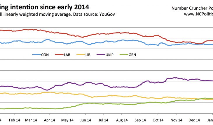
(14) People often think of changes in voting intention as representing swings between parties. But if “don’t know” were a party, it would be doing pretty well. The convention in the UK (unlike in the US, for example) is to exclude undecided voters (with or without an adjustment), so it’s worth remembering just how many of them there are (a lot). There is also plenty of variation by mode (there are typically more “don’t knows” in phone polls) and by pollster. At an average of about 14%, if (hypothetically) they all went the same way, they could deliver a sizeable majority to either Labour or the Tories.

(15) And finally… Unlike Nate Silver’s FiveThirtyEight, no UK election model (that I know of) factors in economic variables. GDP growth and unemployment are one thing, but the collapse in the price of oil, which is gradually feeding through into prices at the pumps (with the customary 4-6 week lag), isn’t yet getting that much attention in a political context. Given how directly energy costs affect household finances (motoring, heating, transport costs hidden in the price of just about everything) this is definitely worth watching, along with consumer confidence and other economic sentiment polling.
15 for '15 – My pick of fifteen charts for the 2015 general election
|
8th January 2015 |
About The Author
Related Posts

Analysis
Scottish Westminster voting intention subsamples
8th October 2014 |
|
Analysis
Scottish boundary changes: New constituencies, same party winning (almost) everywhere
20th October 2016 |
|
Analysis
The Tory task in a historical perspective
3rd October 2014 |
|
Analysis
Copeland turning blue would be more historic than you think
21st February 2017 |
|